hub93
visual identity
![]()
![]()
Hub93 is a petite coworking space, and llano agency’s main objective was to create a visual identity for it.
The inspiration came from the interior design of this coworking space.
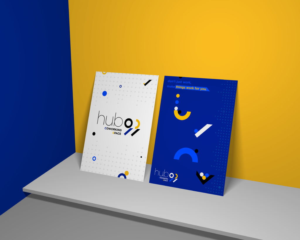
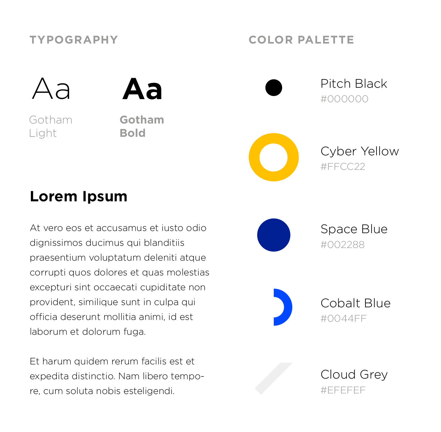
It has blue and yellow elements – the perfect guidelines for this visual identity.
Two versions of the logo were created.
![]()
![]()
Avant-garde gave trance in the second version – the chosen version. llano agency created numbers, 9 and 3, using combinations of modified primary geometry shapes.
Posters are following the same idea of playing with modified primary shapes such as circles and rectangles, which are arranged in a way that induces the perception of motion and co-operation.