
Superfood
visual identity
client
Superfood is a healthy food and drink bar founded by a young couple who wants to improve a healthy lifestyle in their town.
They had a need to refresh their visual identity keeping the bright colors and playfulness of elements in focus.
mission
llano agency wanted to keep the primary idea, but improve it with more movement of the elements in order to bring out the playfulness and the joy of the brand.
All the elements are in their individual tilted positions acting carelessly. The whole logo is refreshed with warmer, more “edible”, colors which are paired with the soƞer lines of elements.
In overall, llano agency created a more warmhearted and playful impression which perfectly suits the young couple and their shared story through this tasty brand.
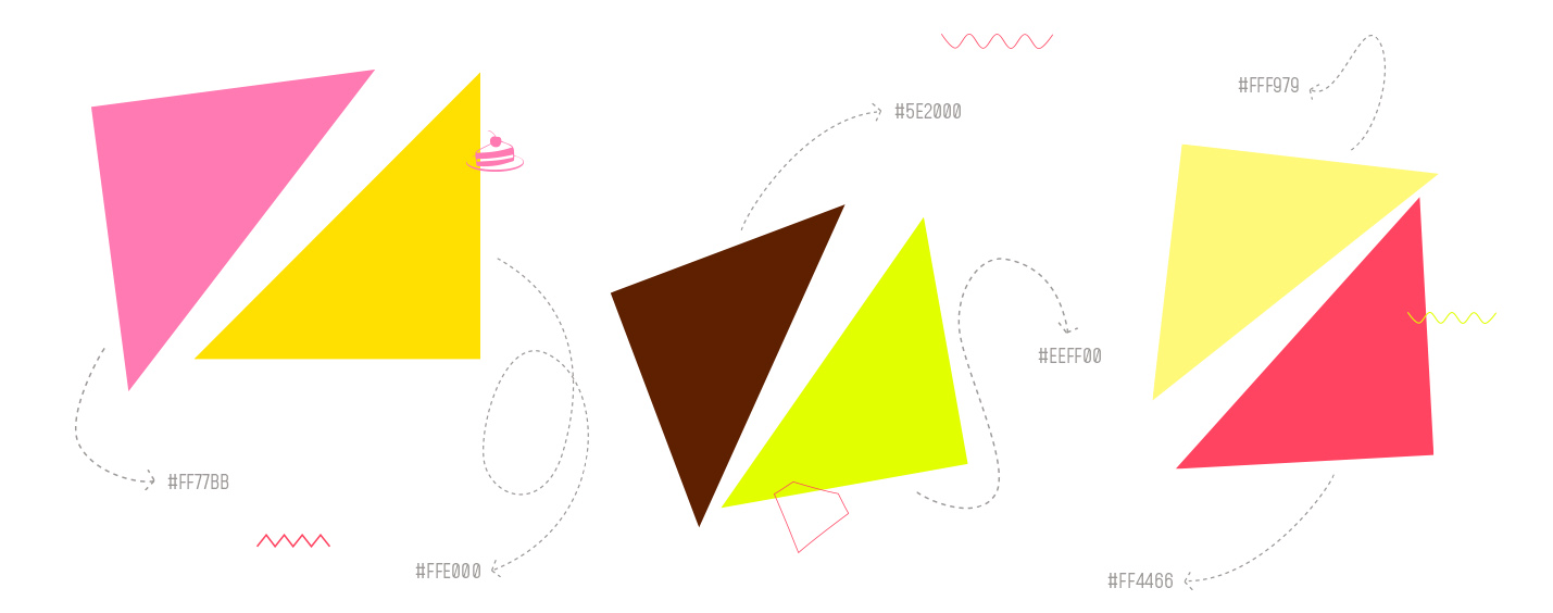

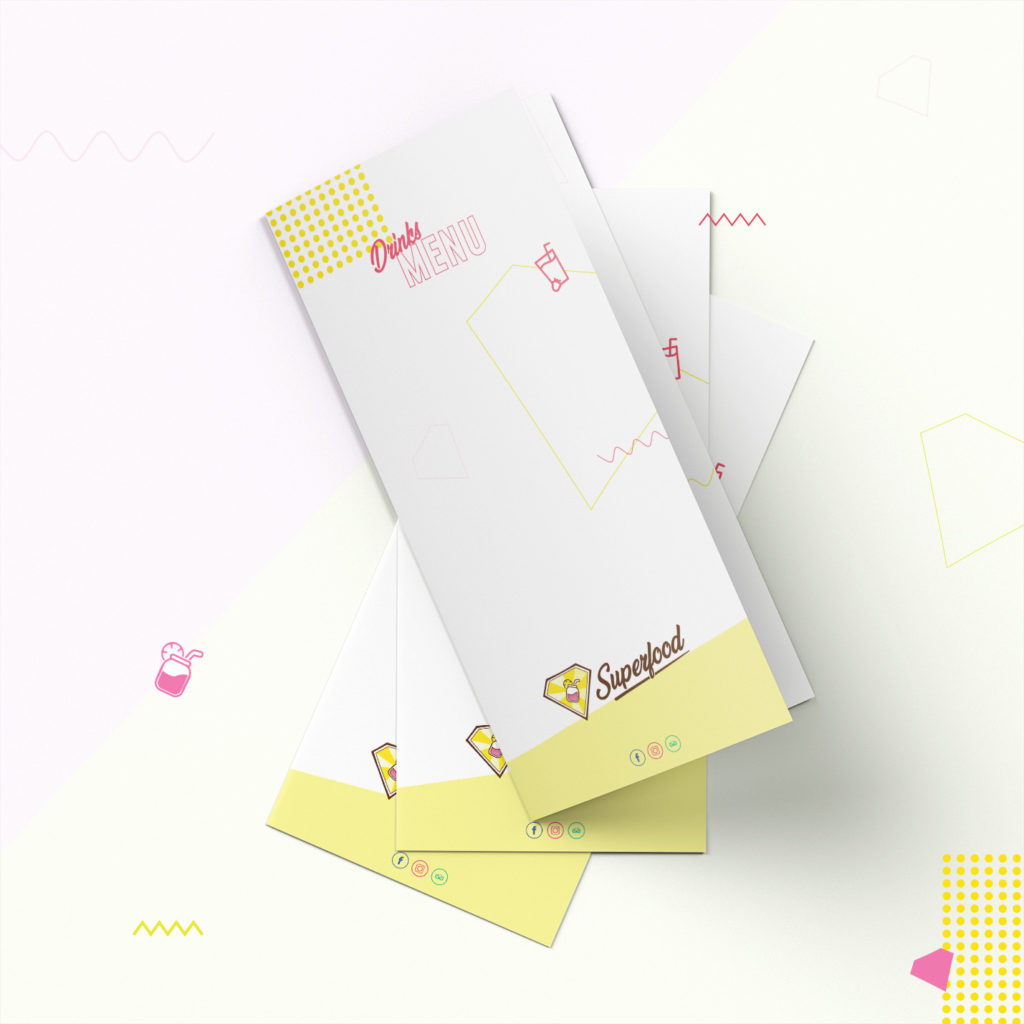

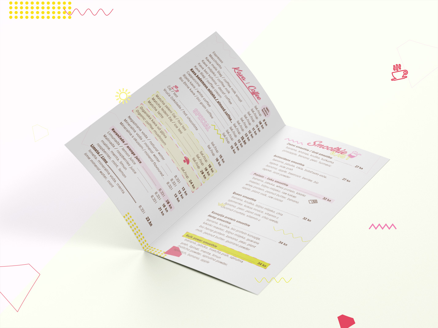
All the promo materials and menus are filled with colorful elements inspired by the memphis design trend, which was a great choice to bring up the playfulness to the next level.
Here are a few examples of Superfood promo materials.
menu design
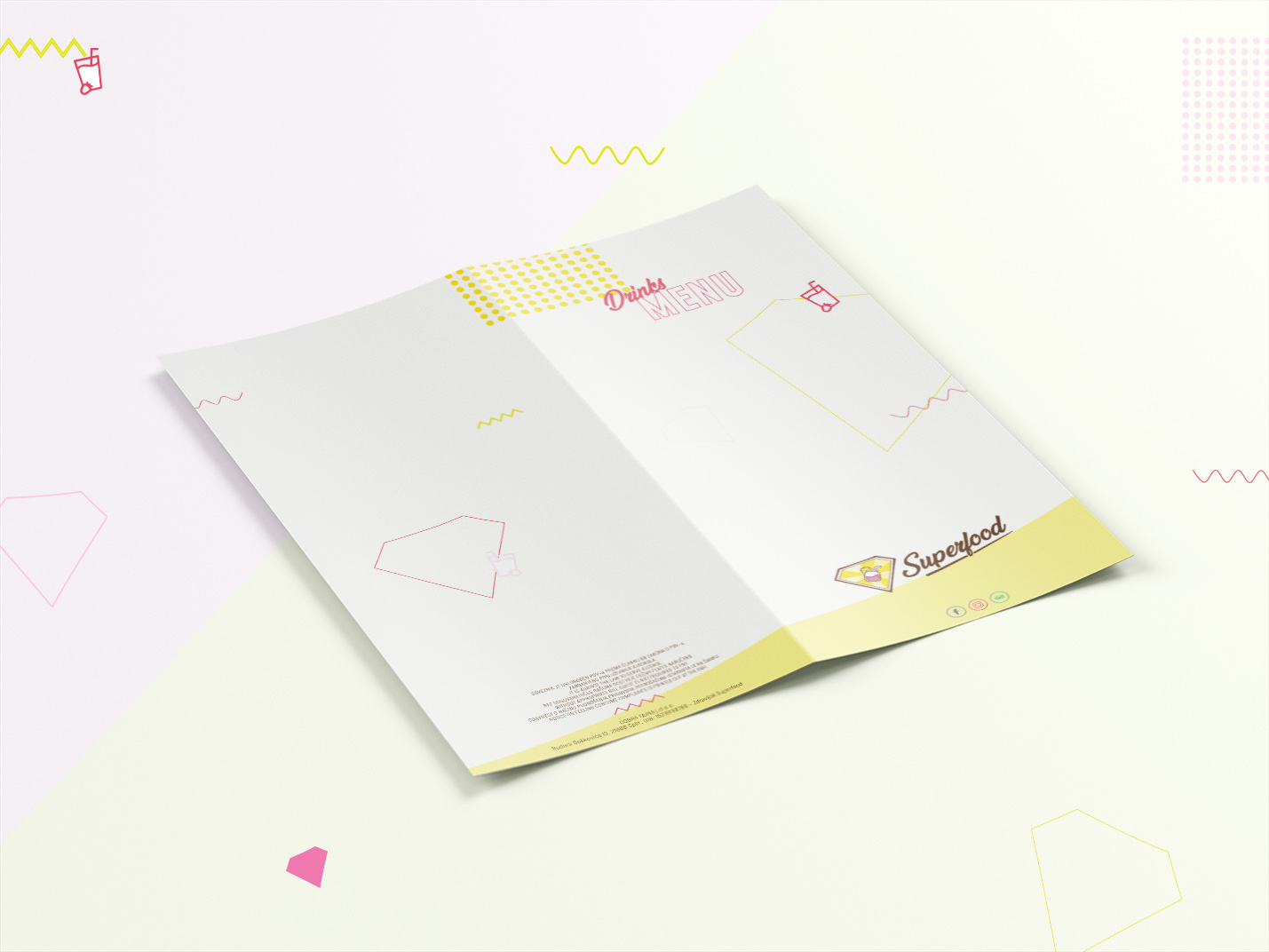
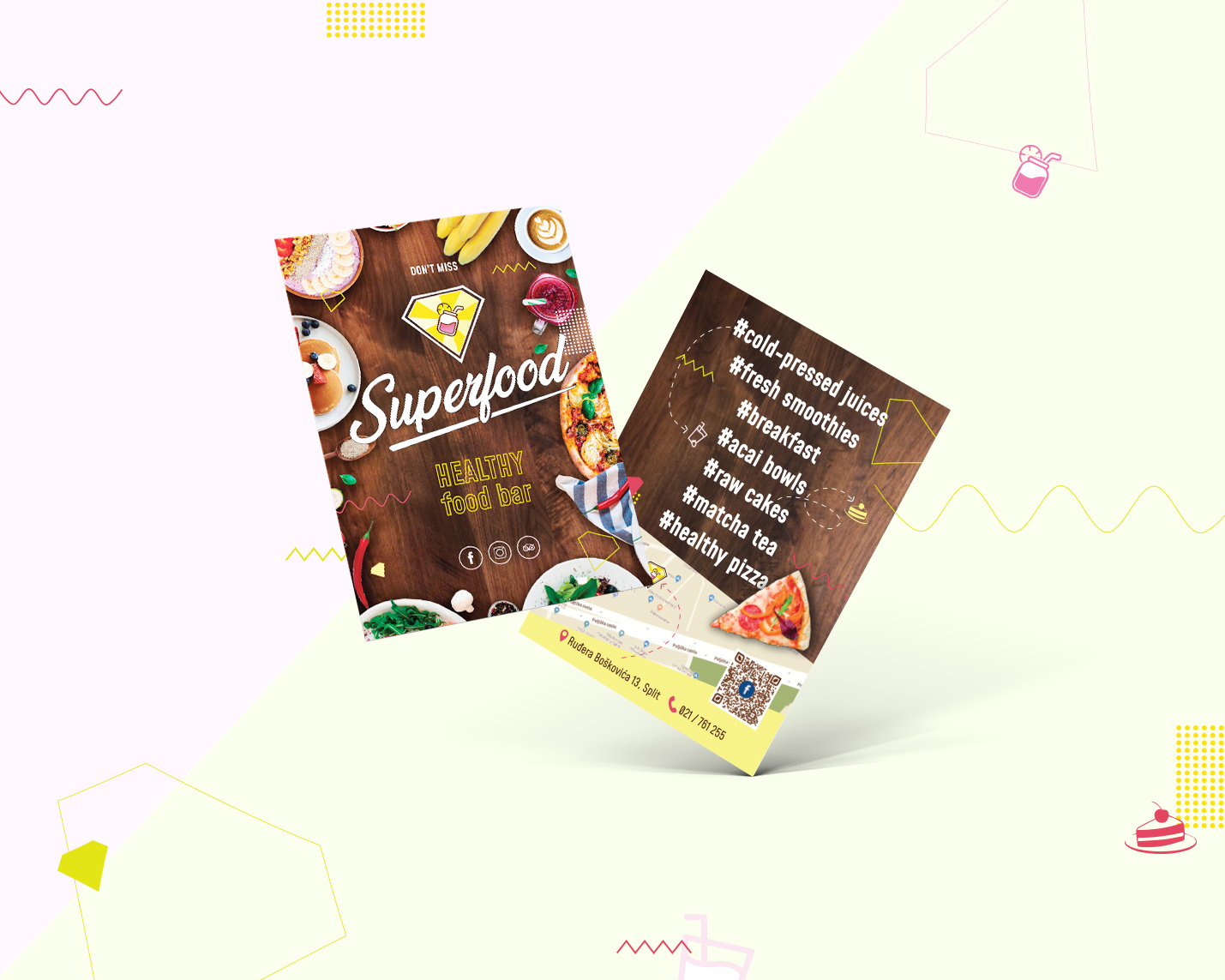
flyer design